"Project management: Navigating a tanker through the storm"
The management of complex projects has often been compared to "navigating a tanker through a storm".
Project managers, as the captains of their ships, are dependent on the rapid collection and processing of information in order to take the right and appropriate measures in good time to achieve their goals. LOP burndown charts are an important tool for navigating safely through the storm.
In this article, we will focus in particular on burndown charts for industrial projects, for example during the construction, conversion or commissioning of systems and machines.
Find out the following in this article:
- What are LOP burndown charts
- How do I create LOP burndown charts
- What does a good LOP burndown chart look like
- The correct interpretation of a LOP burndown chart
- Best practices for use based on a practical chart
- Common mistakes
- What can COMAN do?
- Summary
So, let's get started!
1. What are LOP burndown charts and why are they important
LOP burndown charts are a tool in agile project management that are used to graphically display the progress of a project in terms of work volume over time.
LOP stands for 'List of Open Points' and refers to a list of all tasks that have not yet been completed.
These are usually tasks that were not originally planned - i.e. defects, activities or problems that only arise during project implementation and require our attention!
What's important here is that more and more of these open issues arise during project implementation. So many that the recording and processing of these tasks must be monitored and controlled.
Burndown charts are important as they allow teams to see at a glance how many open items are still ahead of them and whether they are on schedule with processing.
A well-designed LOP burndown chart provides a clear visualization of current performance compared to planned performance and thus helps to identify deviations at an early stage. This allows project teams to act proactively to resolve issues and get the project back on track.

2. The basics of creating an LOP burndown chart
In order to create an LOP burndown chart, all open points of the project must first be recorded and provided with estimates for the effort. Easier said than done, as project management uses its own tracking tools for this. But that's a topic for a separate article - so here's the chart for now.
The open points are plotted in a diagram, with the y-axis representing the remaining effort (or optionally the number of open points) and the x-axis the time.
At the beginning of the observation period, the total amount of effort is entered on the y-axis. With each working day, the effort actually completed is deducted, so that a descending line - the burndown - is created.
At the beginning of the project, the increase in open items will exceed the number of completed items. The characteristic burndown curve does not occur until later.
When creating the chart, it is important to update it regularly in order to document the actual work performance compared to the planned performance. This is the only way for the management tool to develop its full effect and support project control.
A classic burndown chart could look like this. The blue line is the total number of recorded tasks, the black line shows the tasks that have not yet been completed:
There are only three statuses for a task in this burndown chart. Open, Completed and 'Check' - an additional status has been introduced here with 'Check' to highlight important tasks or delays and keep an eye on them.
3. interpretation of LOP burndown charts to improve project management
Interpreting an LOP burndown chart correctly is crucial for project management.
An ideal burndown line falls evenly and indicates that work is progressing as planned.
Deviations from this line can indicate problems. For example, if the line is stationary, this means that no progress has been made. If it even rises, more new tasks have been added than have been completed.
It is important to pay attention not only to the trend of the line, but also to its shape. Erratic fluctuations can indicate irregular work performance or estimation errors during planning. By recognizing such patterns early on, project managers can take countermeasures and thus increase the efficiency of the team.
Important to note: Depending on the version, the burndown chart only shows the number of tasks that have actually been recorded and processed. For the time being, it does not allow any conclusions to be drawn about the type, scope and priority of the tasks
If the number of tasks generally decreases, that's fine. But if the number of critical problems remains the same or even increases at the same time, project management needs to take action.
It may therefore make sense to create a separate LOP burndown chart for a specific type of error or defect, as the processing of these may be particularly safety-relevant.
4. Best practices for the use of LOP burndown charts
There are several best practices for the effective use of LOP burndown charts. These include making the chart visible to the entire team, for example by posting it on a notice board or in a shared digital tool.
Also, the data in the chart should always be kept up to date to ensure the accuracy of project monitoring.
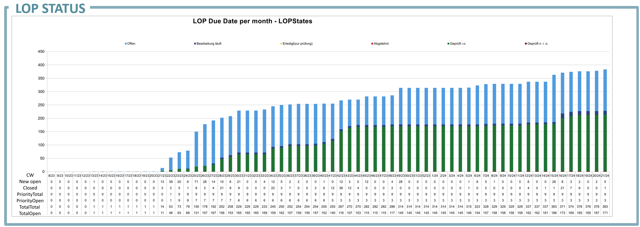
Let's take a look at a professional burndown chart. In this case from the automotive industry for the ramp-up of a car production line:
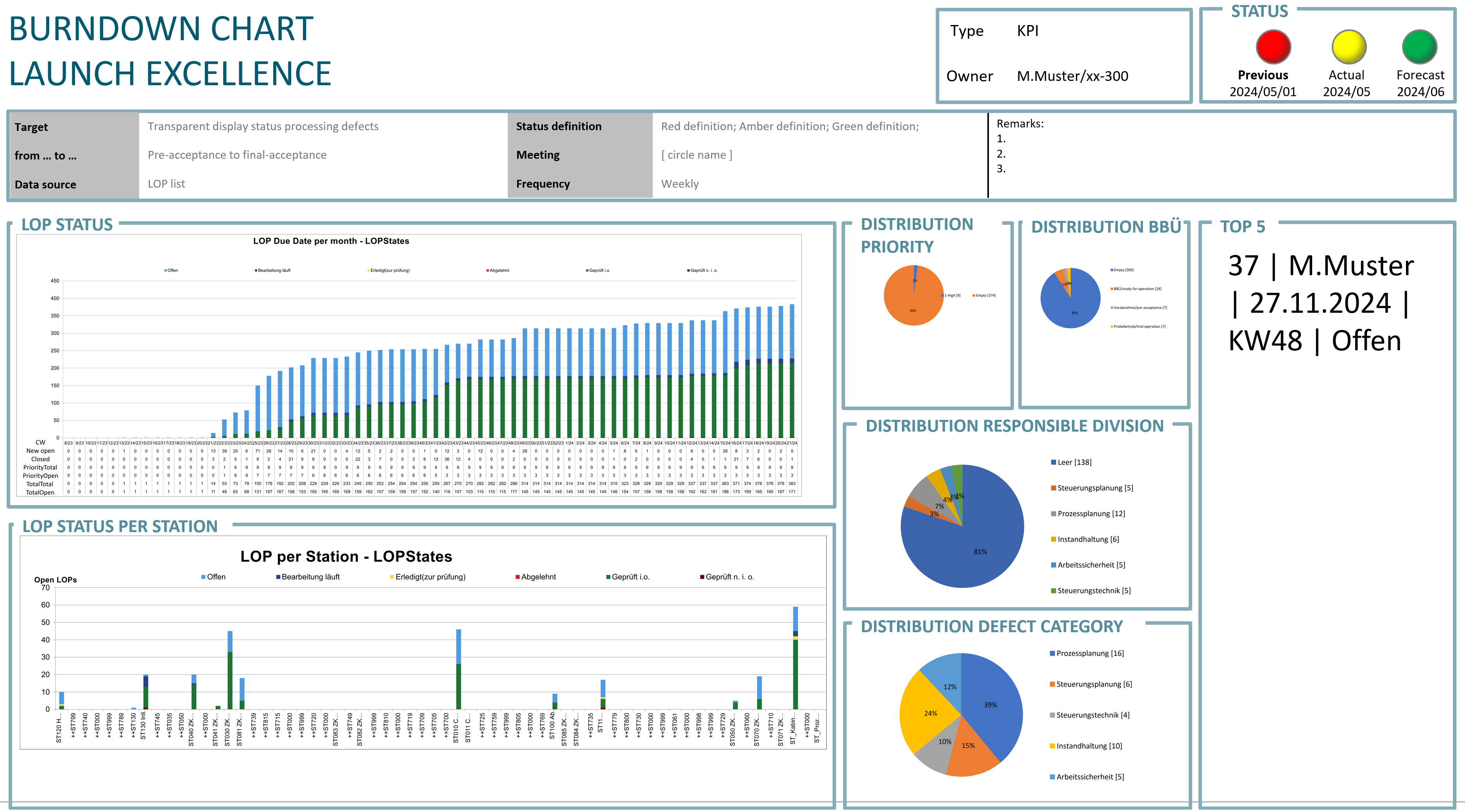
The actual burndown chart is located here in the center-left. However, further relevant information relating to the chart has been provided around the burndown chart.
In this project, there are the following statuses for an open point:
- Open
- Processing in progress
- Done (for review)
- Rejected
- Reviewed ok
- Reviewed n.i.O.
In particular, the status 'Checked n.i.O.' (Checked, not OK) is particularly exciting
.
In many cases, defects that have been recorded are provisionally rectified by the subcontractor, marked as completed and not questioned further. If the defect then occurs again, there is a late, nasty surprise. With this status, the team also keeps an eye on subsequent improvements.
 The four areas 'Priority', 'Ready for operation handover' (BBÜ), 'Responsible department' and 'Defect category' also provide a better overview and control.
Here, particularly important tasks can be highlighted, phases mapped or even specific departments and trades as well as task categories analyzed.
This way, each department knows how it is performing in the processing of open points and where there is still a need for action.
Note: 'Empty' or 'Empty' indicates that there is either an 'Other' field here or, for example, that external project participants such as suppliers have not been named in more detail.
The responsibility for these tasks is unspecific or is specifically assigned to individual suppliers and team members.
Regular meetings in which the burndown chart is discussed promote an understanding of the project status among all team members and enable collective decisions to be made on the prioritization of tasks. A clear definition of what is considered 'done' is also important to avoid misunderstandings and ensure data integrity.
Finally, the 'LOP per station' view can be used to highlight particular focal points or focus on specific areas of the system.
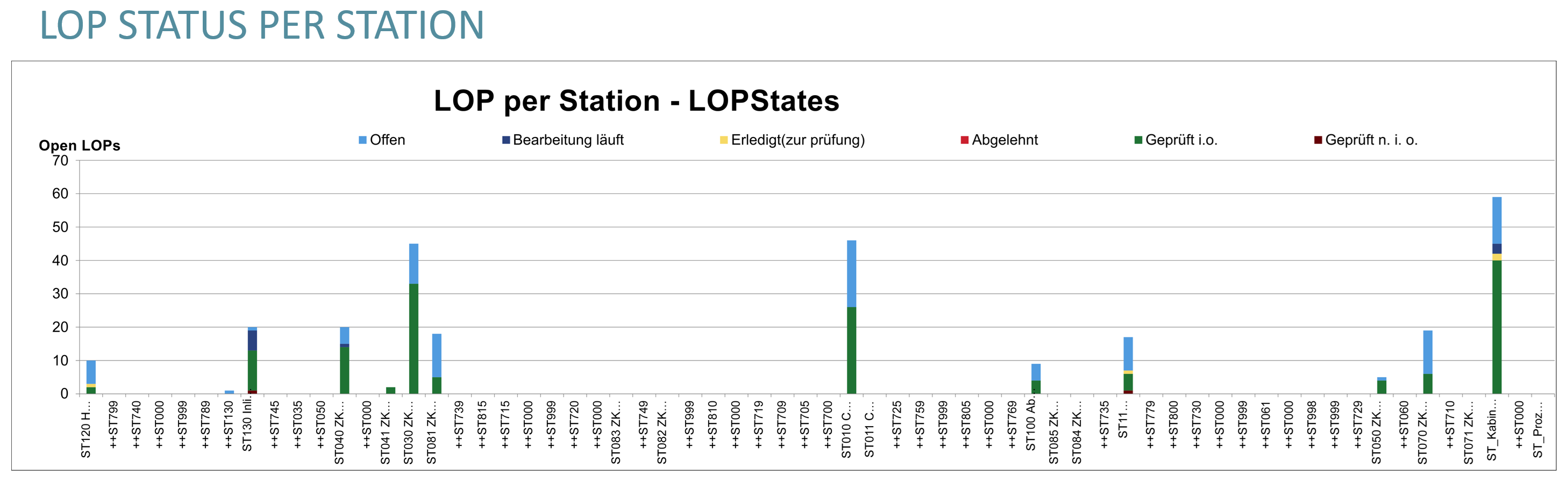
Overall, the chart is already very extensive. But if you just take a look at the changes and progress each week, you will quickly gain excellent transparency and general knowledge about the problems and performance of the individual areas and teams.
At best, the chart fills up fully automatically through direct data export from the LOP or progress recording systems used. Find out more at the end of the article.
5. Common mistakes when using LOP burndown charts and how to avoid them
A common mistake when using LOP burndown charts is neglecting updates, which leads to a falsification of the project progress display. It is essential that all team members continuously enter their progress.
Neglecting updates is recognizable by an abrupt increase or abrupt reduction in open points with large time intervals in between.
Here, a team member or supplier only records the status irregularly or, for example, once every two weeks - far too infrequently to find reliable data in the burndown chart on the basis of which decisions can be made.
In addition, you should avoid overloading the chart with too many details, as this impairs readability and obscures the core information.
Another mistake is not adapting the chart to the specific needs of the project. Not every project is suitable for the standard display of a burndown chart. It may therefore be necessary to customize the chart individually.
Lastly, it is important that the chart is used as a tool to promote communication and not as a control instrument.
This is the only way to ensure an atmosphere of trust and cooperation within the team.
6. Effective project tracking - LOP burndown charts and progress tracking with COMAN
In the world of project management, it is crucial to efficiently record and process the multitude of open points and defects
.
The COMAN project management software offers an innovative solution for this, enabling teams to record tasks directly on site or in the plant and feed them into a central system in real time.
When recording with the COMAN Mobile there is intuitive user guidance. Open points are classified, described, assigned and stored centrally.
A meeting mode enables defects to be filtered and discussed in a team or in a larger project management meeting. The data flows into the COMAN dashboard in parallel.
The use of burndown charts in the COMAN Dashboard gives project teams a clear overview of the progress of work and allows them to identify deviations at an early stage.
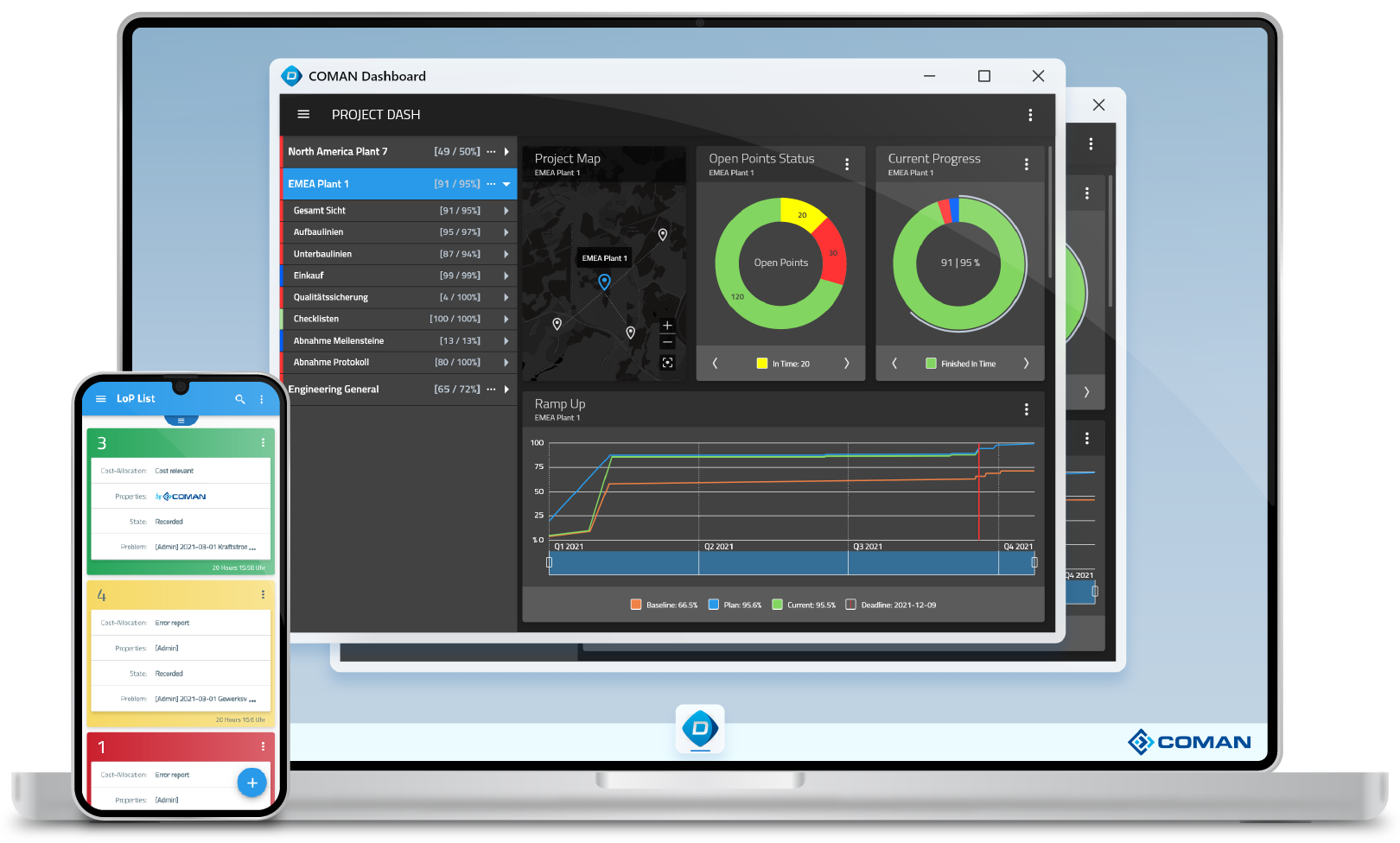
The visualization of the current performance compared to the planned performance makes it possible to act proactively and bring the project back on track. Individual reports with corresponding LOP burndown charts and other details can also be generated from here as PDFs, Excel or PowerPoint reports with just one click.
7. Summary and conclusion
In this blog post, we have examined the importance and application of LOP burndown charts in project management.
We learned how important it is to update the chart regularly to accurately track the progress of the project and identify potential problems early on. By interpreting and adapting the chart correctly, teams can work more efficiently and make better decisions.
With the use of tools such as COMAN, teams can increase the efficiency of their project management and ensure the success of their projects. Let's continue to explore the world of LOP burndown charts together and learn how you can take your project management to the next level. Stay tuned for more exciting insights and tips!